Interior Design, Vermont.
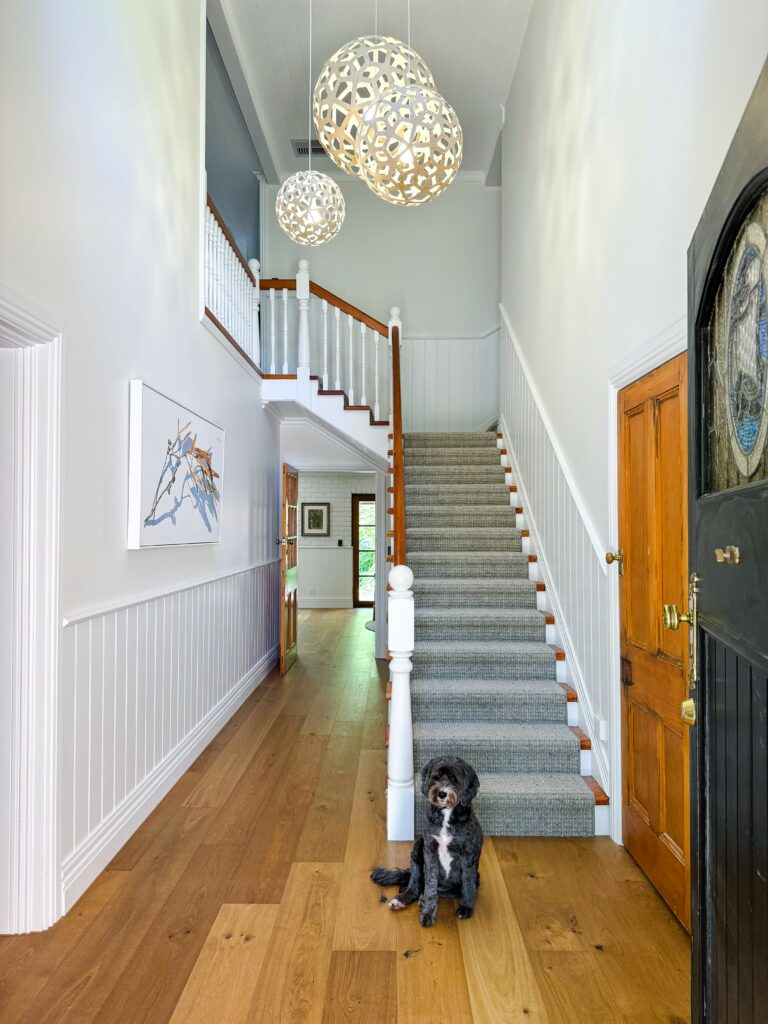
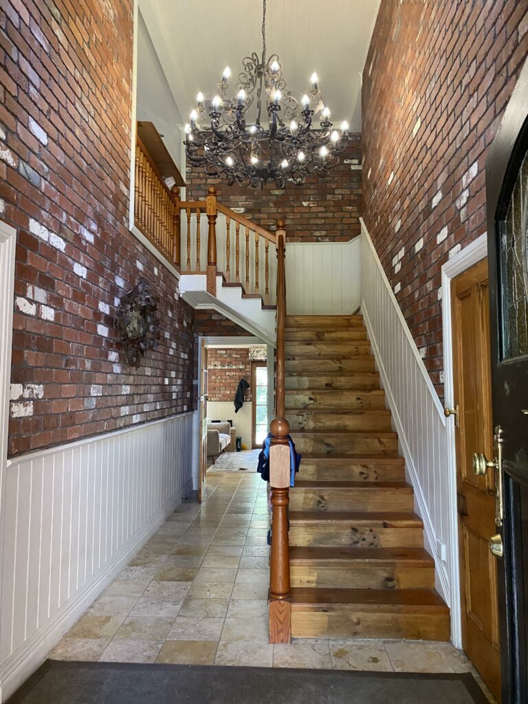
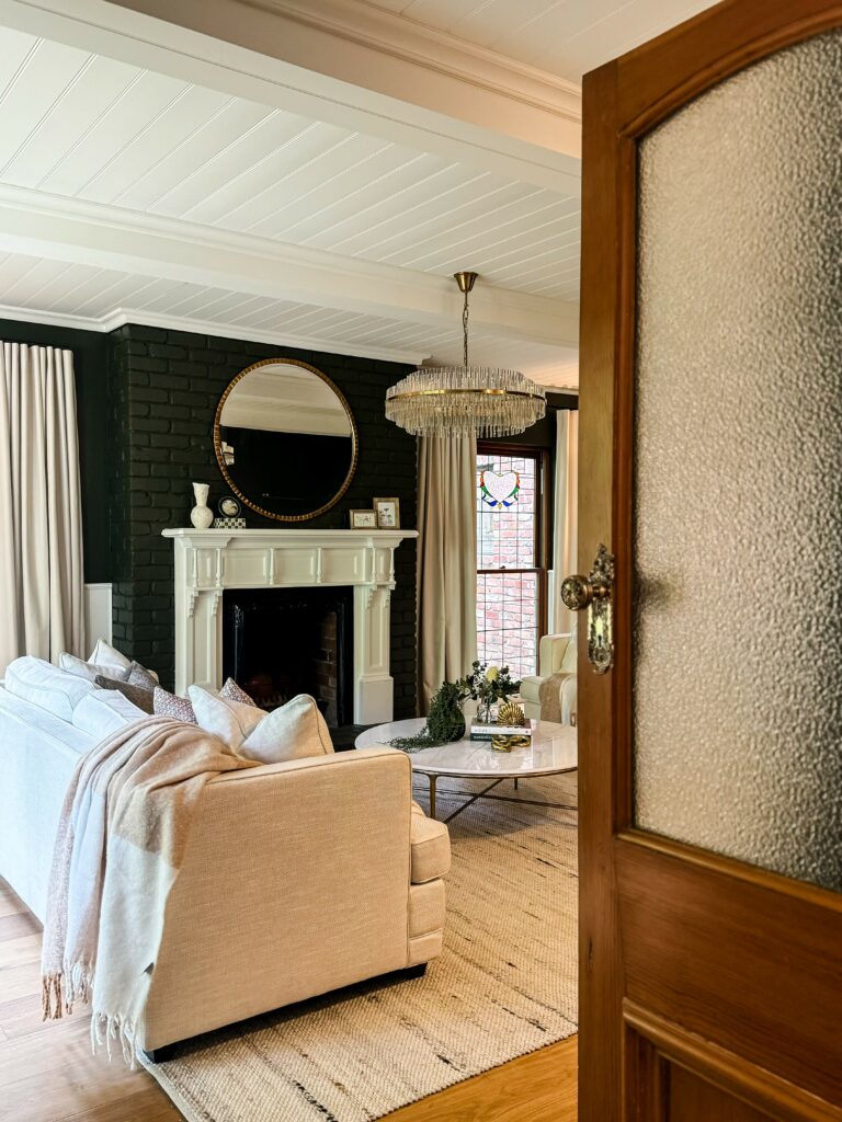
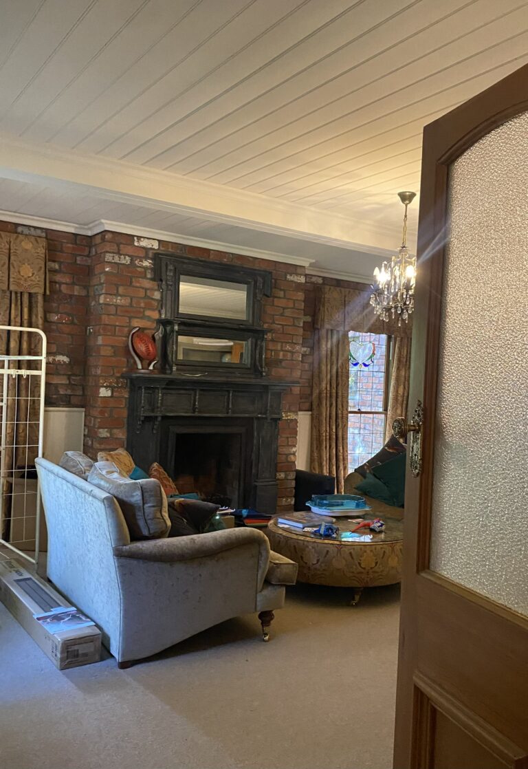
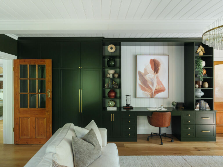
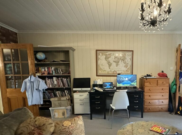
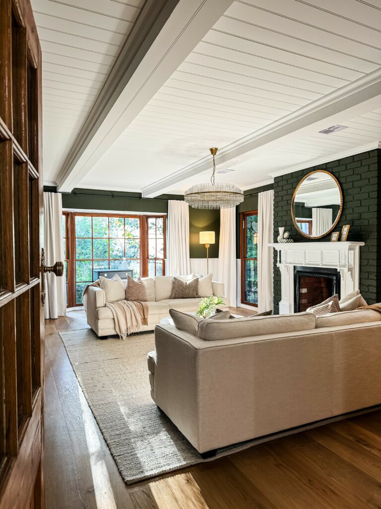
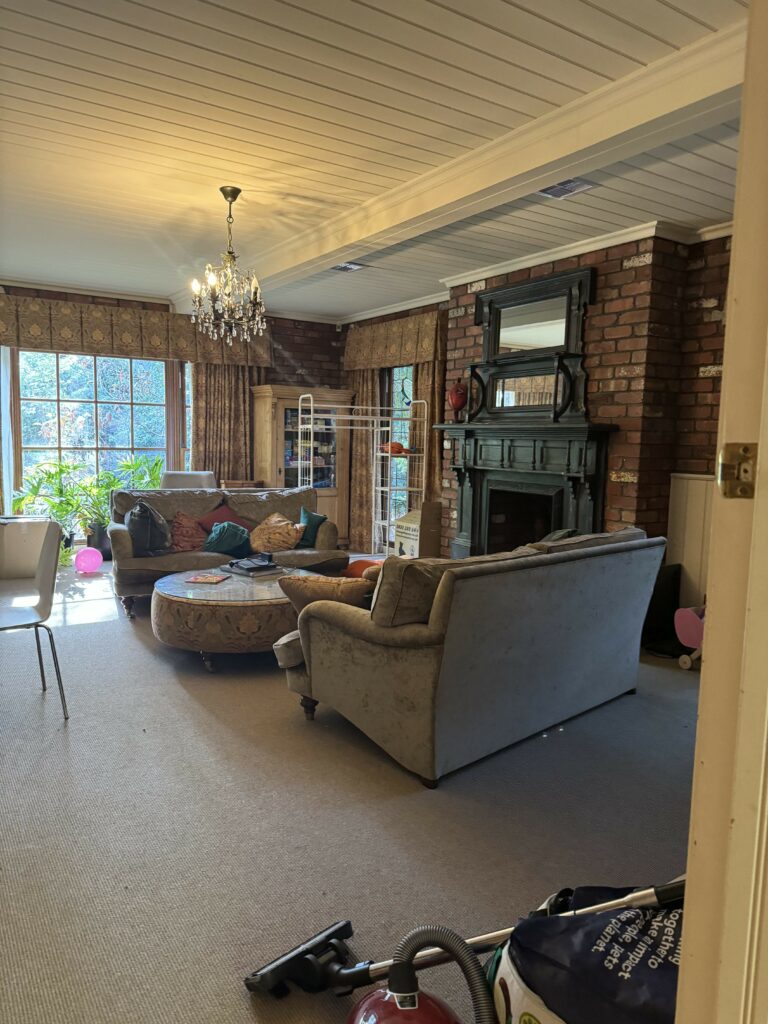
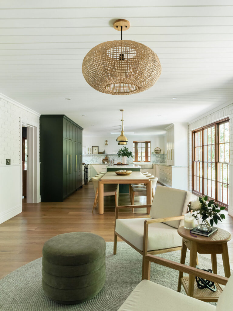
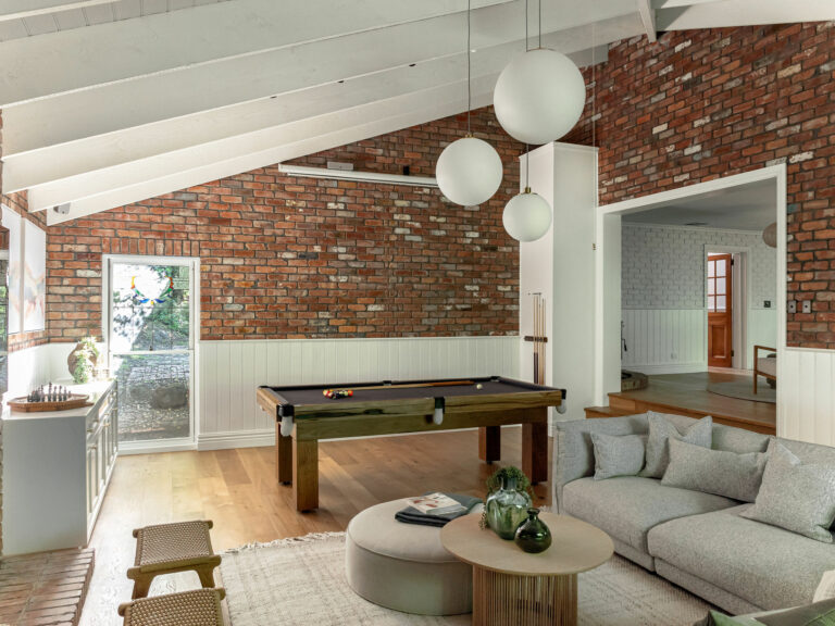
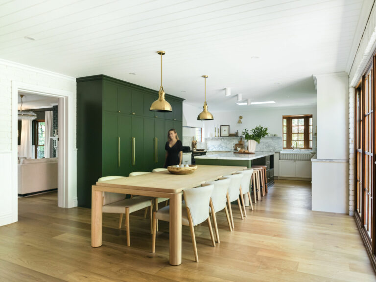
Entrance, Formal Living/Office, Kitchen/Dining and Rumpus room.
Watch the project walkthrough at Vermont
Photo's at Vermont
Short interview with David, the homeowner...
Slide through the before and afters...
The Location:
Interior Design in Vermont, Melbourne.
The Brief:
In December 2023, my client approached me to assist with the renovation of their impressive double redbrick home, set on approximately 2,600m² of land.
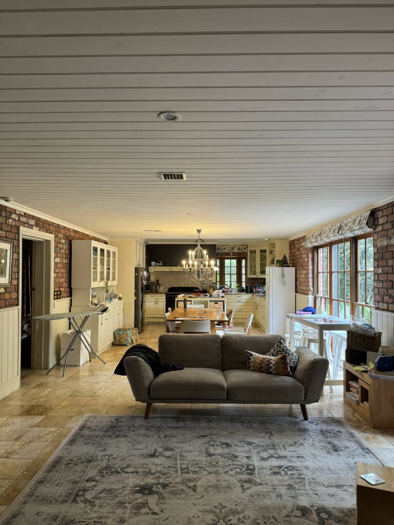
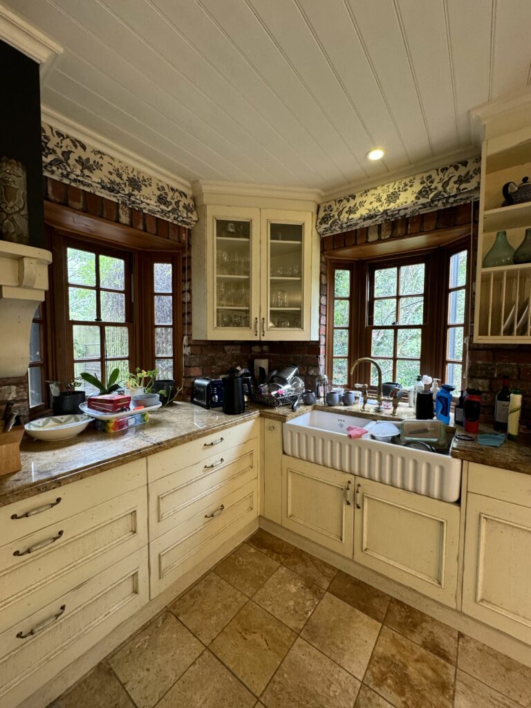
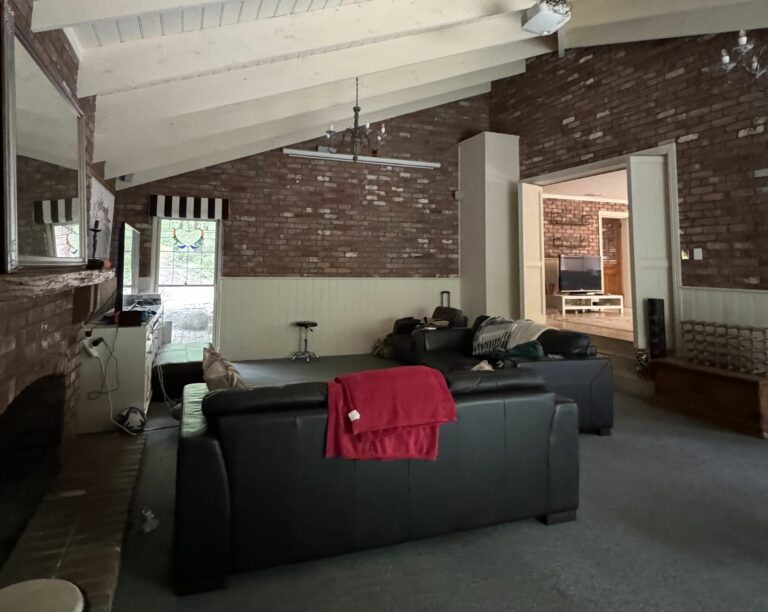
The home’s interior featured extensive exposed red brick, which we agreed felt overwhelming. To honour the brick’s origin—salvaged from Melbourne’s historic shot tower in Melbourne Central—we decided to retain some of its characters while softening the overall look.
Given the scope of the project, we decided to tackle it in two stages. In the first stage, we focused on redesigning the entrance, formal living/office, kitchen-dining area, and rumpus room. The bedrooms will be addressed in stage two at a later date.
My clients envisioned a more modern entrance, incorporating classic and country farmhouse elements throughout the formal living/office and kitchen spaces. Their love for a dark green, modern country-style kitchen inspired the idea to extend this rich colour palette, creating a seamless connection with the lush greenery visible from the outside.
Overview:
- Cover most of the exposed brick while preserving select sections to honour the home’s history.
- Enhance the overall lighting plan with a mix of natural and artificial lighting.
- Improve spatial planning across key areas.
- Create a multifunctional office and formal lounge space with ample storage.
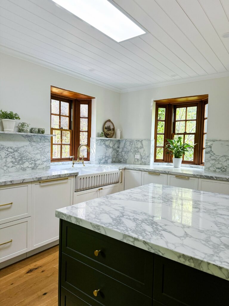
- Expand the kitchen and optimise the space for entertaining.
- Design a more functional kitchen, including fixtures and fittings.
- Retain original features such as the Belfast sink, vintage stove, fireplace, doors, and handles.
- Select window treatments, wall finishes, and updated flooring.
- Complete the furniture and décor fit-out.
The Goal:
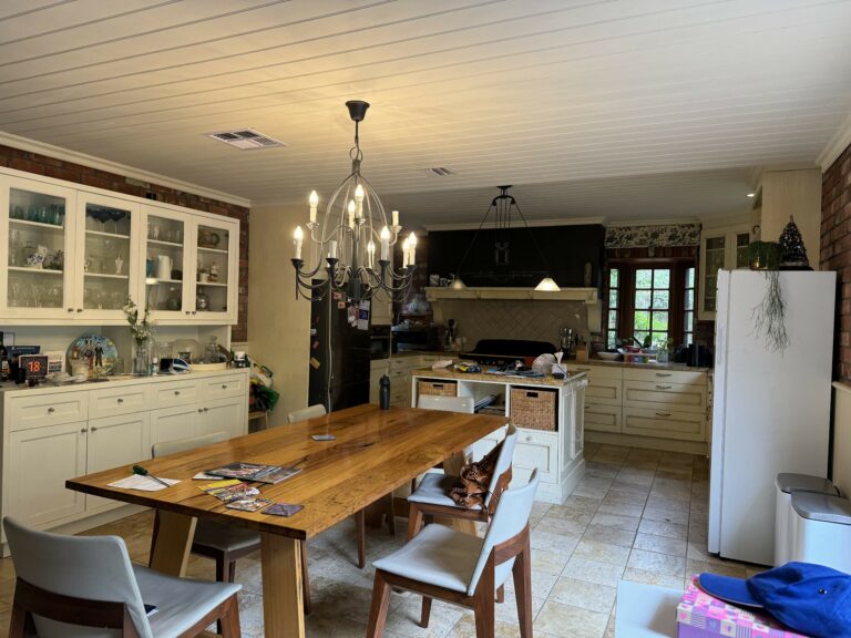
When I first visited this property, I was struck by the generous size of the rooms, but the overwhelming amount of exposed brick made the spaces feel dark, cold, and unwelcoming. The lighting plan was unthoughtful, with only one central light hoping to light up an entire 7 x 5.5m room!
The family purchased the home for its unique historical character, with vintage finds from around the world thoughtfully incorporated by the builder. However, they were unsure how to honor the home’s rich history while making it feel more inviting. As this is their forever home with no plans to sell, our goal was clear: to transform the space into a comfortable, functional, and welcoming environment they would cherish for years to come.
The Process:
Google Review:
“We struggled to finalise a plan to renovate / redecorate our house for a year or two. it was dark and dated but it had a layout we liked and we couldn’t figure out how to bring it to life. Working with Tracey changed all that and we have ended up with a renovated home that we are rapt with. From the word go she listened to what we wanted, she provided great insight and ideas, she understood our needs from the house and she delivered.
Having not used an Interior Designer before we were a little sceptical on the process but Tracey quickly put us at ease – so much of the work was done in the lead up and her design process really eliminates a lot of the uncertainty and indecision
Having determined our design plan Tracey did a brilliant job co-ordinating it all, from arranging some great builders to sourcing perfect furniture, all the way through to the final touches / styling which is definitely out my comfort zone. She was easy to work with and she worked brilliantly with our fantastic tradesman to demand a very high level of finish which meant we got exactly what we had hoped for. One thing we really noticed was that Tracey helped us make braver decisions – our uncertainty would have most likely resulted in us defaulting to the boring colour or the simple option. Tracey gave us the confidence and the insight to take a few risks and be bolder..
We are very happy with the final product and we couldn’t have achieved it without Tracey and her skill and drive.. We came in unsure out whether to use an interior designer and we came out convinced that if you find the right one its worth its weight in gold…“
