Your home is your biography and tells the story of who you are. I am here to help you write your next chapter.
How do I spatially plan my room?
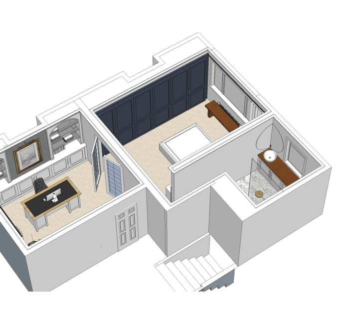
Spatial planning is one of the most important stages of the Interior Design process and should be carried out above all else. Space planning is the foundation to the rest of the project, ensuring all of the pieces of the puzzle will fit. Interior Design is not just about picking pretty fabrics and colours, there is a whole layer of technical organisation involved which is crucial to the functioning of a space.
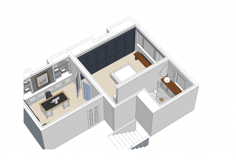
When I am examining a new project, I familiarise myself with the footprint of each room. Firstly, I assess where the key elements are such as doors, windows, fireplace, ceiling lights, electrical ports, plumbing etc. I then think about how each space will be used and figure out the function of each room/section of the room. Once the activity zones have been mapped out, I can start figuring out the circulation of movements around each space, to discover the proportions I can use for future furnishing etc.
Let me break this process down so that you can do it yourself!
How do I start designing a space? Map & Measure!
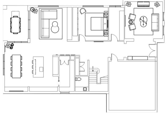
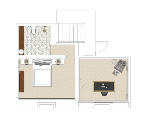
Let’s assume your room is empty for this article. First and foremost, map out the shell of your room or if you have an architectural floor plan handy, print that off as they will have accurate measurements. Draw (or take note) of where the focal points are within the room. Focal points are things like fireplaces, windows or structural features that should not be covered.
Start taking measurements of each wall, ceiling height, nooks, built-in units, windows, kitchen island etc. so that you can figure out what scale of furniture you’ll need. Don’t forget to measure your access points into that room to ensure the products will actual fit. I’ve heard too many stories about clients ordering furniture that was too big to fit up their narrow stairs or lift. If you are using a floor plan from a real estate agent, please do not assume they are correct. Quite often, they will be out by 10-30cm which is everything when it comes to accurate spatial planning.
Questions to ask when spatial planning a room
Now that you have mapped out your room(s) plan, it’s time to start asking yourself some important questions to determine what is needed. Here are some questions I ask my clients each time I design a room;
- How will this space be used? Formally, causally, as a rumpus, reading room etc.
- How many people live here and what are their ages. We need to start thinking about clever materials for kids/pets if any.
- How many people use the sofa at one time?
- Do you like to host guests regularly? If so how many at a time? We need to think about practical seating.
- What colours/styles/designers do you like (besides me of course)?
- Do you have any special requirements or needs in this home that you didn’t have before?
- Will this room become a multi-functional space at all (now that we work and exercise from home)?
- How do you want the room to feel; open and airy, relaxing or cosy?
Spatial Planning makes perfect!
Those questions are pretty general but necessary. I tend to dig much deeper into the specifics to figure out exactly what my client requires. I’ll ask about their preference in sofa comfort, if they need specific spinal care for their mattress, if they have enough storage, if they have hobbies that might translate nicely into the design concept, if they have a preference in materials for dining/coffee tables etc.
I will also ask about the problems the room(s) might possess so that I can keep it in mind when designing the space. The room might be very narrow, or dark, or have multiple access points causing a disturbance, tall ceilings making it cold in winter etc. The whole point of this exercise is to think ahead and prevent issues from arising, just like a game of chess!
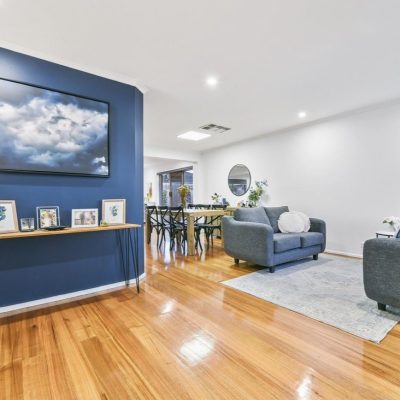
Space Planning Concepts
Now that the right questions have been asked you will have a better understanding of how you want to use the space. You will be able to figure out your furniture needs, the scales required, the issues to consider/solve and the materials most suited to your lifestyle.
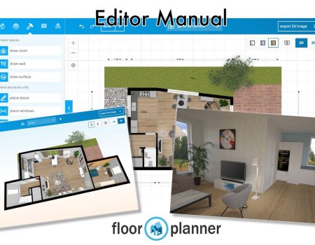
Next, we’re going to plan your furniture coming into the room(s). You should do this roughly at first so that you can play around with furniture configurations to determine what layout work best. Start drawing generic shapes on your floor plan for now to figure out what works best in your space. Once you start feeling comfortable with your furniture selections and spatial layout, you’ll need to map it out to scale. This stage is crucial to avoid errors. Without doing this, you could end up with a hobbits sofa in your spacious living room! You can use graph paper or use a user-friendly website to design a room plan. “Floorplanner.com” is free to use and very user friendly! Be warned…its addictive!
Learn from examples
Now that you have the theory down, i’ll show you some examples of how I spatially planed some rooms.
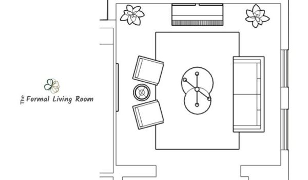
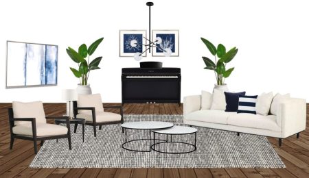
The room above is the first room you see when you walk into this Hamptons home. There is no door at all, so we decided that this room would be like a “showcase” room. One that rarely gets used and is more of an eye pleaser when you entered the home.
The first thing I wanted to do was centralise all the furniture to make it more of an intimate conversational space. By using a large rug, I could create a very clear “zone” with clear access surrounding the furniture. The upright piano is a focal point within the room and the space revolves around a centre point (the pendant).
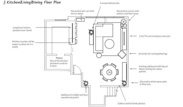
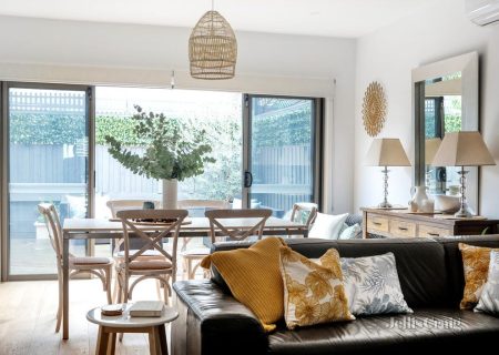
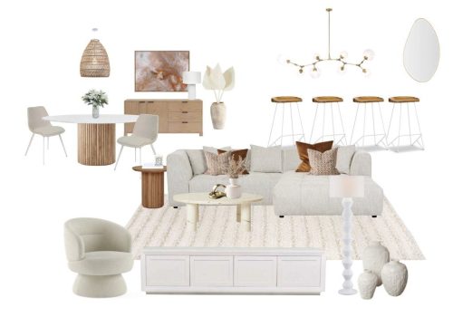
This client originally had her dining area where I have placed the living area. This was an issue she didn’t realise she had because the layout meant that the dining room was oversized and the living room was undersized. My aim was to provide more seating solutions without cramping the space.
The generous sized sofa could now sit an extra 1-2 people, plus she gained an extra seat by the TV unit for guests (previously located in the dining room with no purpose). The console behind the sofa created an invisible corridor zoning that space.
The 1.5m round dining table comfortably sits in its new location allowing for 6 people (same as before). This dining zone was highlighted by the large pendant above.
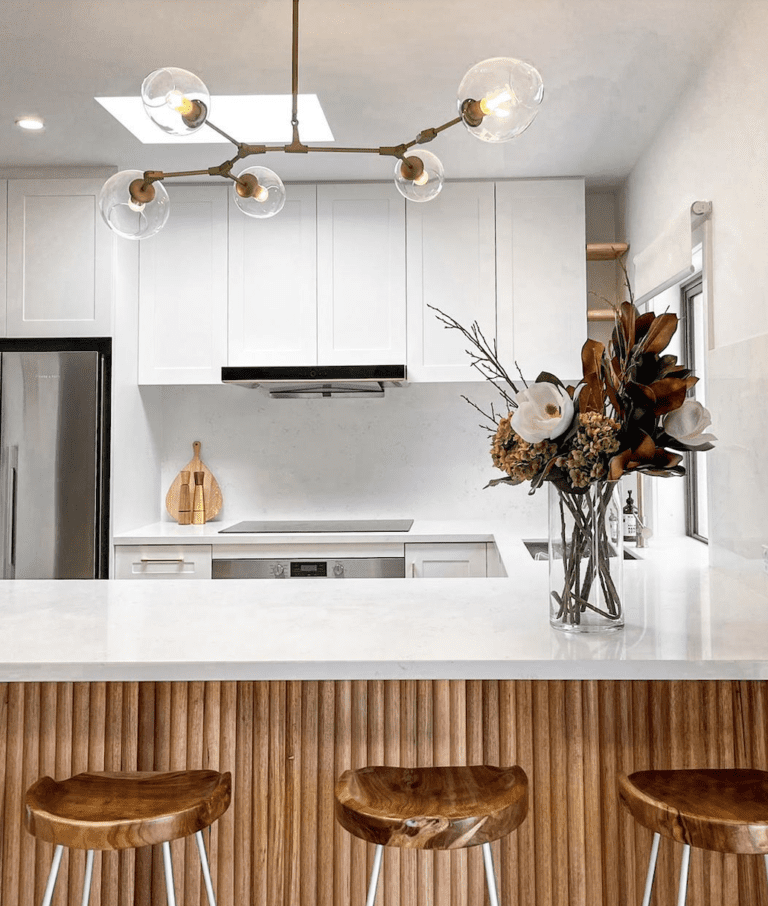
And finally, the kitchen island was extended by an extra 1200mm allowing for 4 stools instead of 3 and more prep space. New design below:
Quick measurements and tips for your home
For this last section, I want to share some quick takeaways for spatial planning your room(s):
Quick Measurements:
- Kitchen bench top H90cm. Remember to keep your fridge, cooktop and sink in a triangle shape for easy access.
- Pendants over dining table should have at least 90cm clearance
- Walkways between furniture : 70-80cm
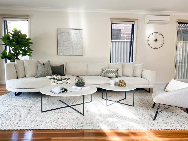
- Distance between sofa and coffee table : 45cm
- TV height : centre of tv at eye level when seated.
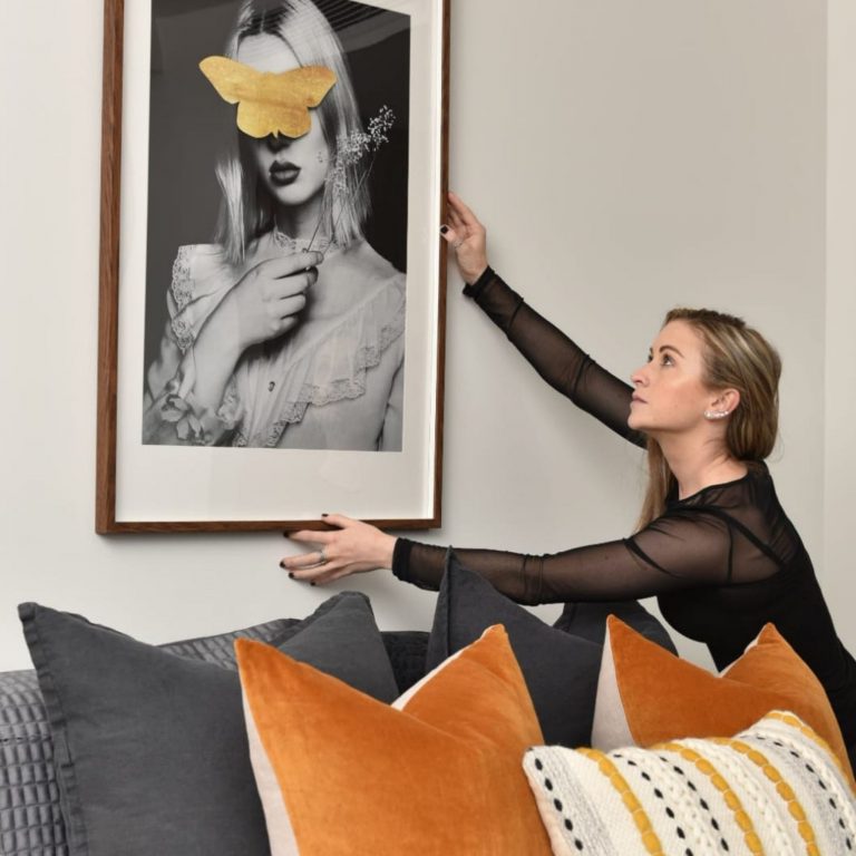
- Art height : eye level when standing (around 1.5m from ground). Read more about art hanging HERE
- Hang curtains as high as possible to make the room feel taller. Read more HERE.
- Rugs should be bigger than the furniture they are under. See my blog HERE.
Quick TIPS:
- Fill your room proportionally. Just because a King bed fits, doesn’t mean its right.
- Ensure there is enough walking space
- Form follows function. Add pieces because you need them first and then add the decorative pieces after (if you need to fill space).
- If your room is smaller, avoid chunky large scale items.
- If your room is bigger, go for larger, fuller furniture.
- Play with different scales and heights in your furniture for visual interest.
- Play with shapes. A square shaped sofa will look great with a round coffee table.
For me, spatial planning a room is my favourite part of the job. It is problem solving and for me, that is satisfying. If you feel overwhelmed with this part of your home design journey, don’t worry. I am here for you. Reach out if you need some assistance.
Thanks for reading, take care.

Tracey Bright
< Click my face to get in touch.
If you learned a thing or two, share this blog on your socials below.

